Psicotools Re-Branding
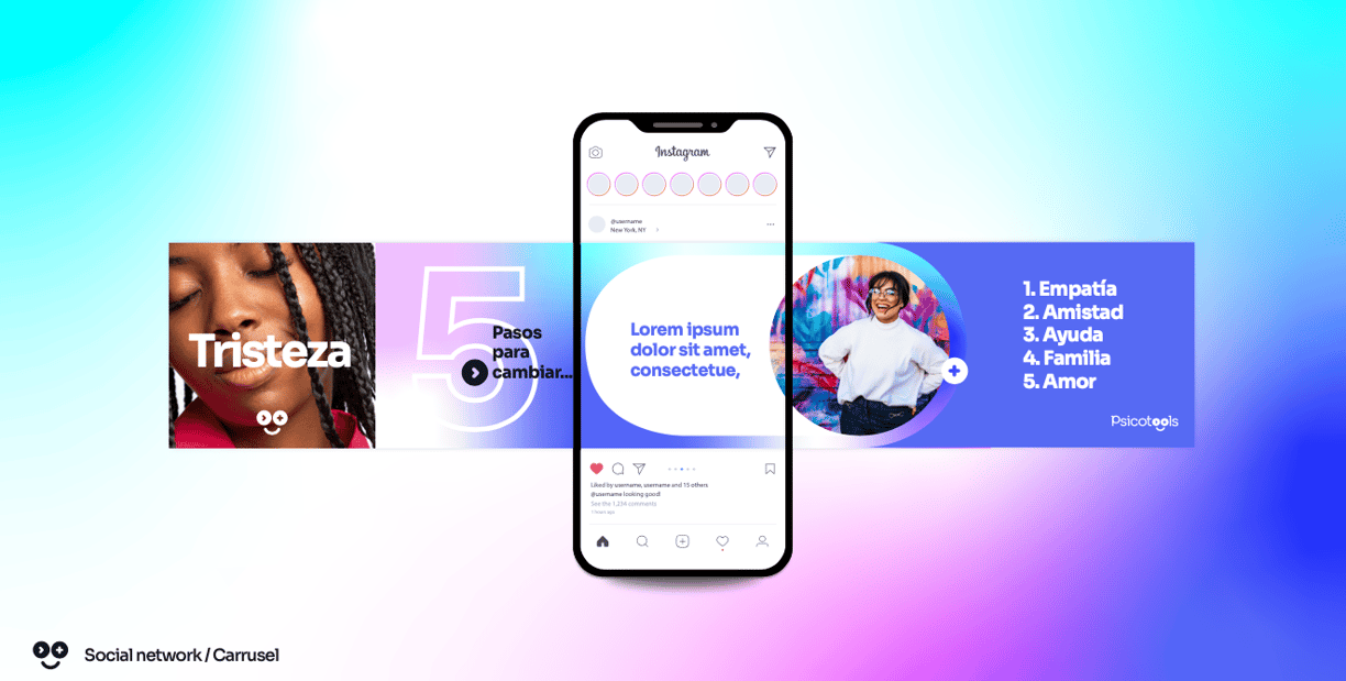
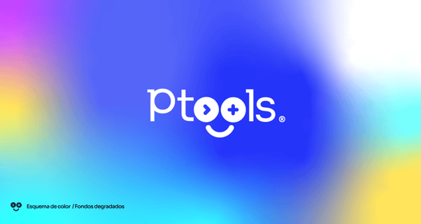
Psicotools embarked on a transformative brand redesign project, reimagining the essence of psychological support as an evolving journey toward emotional well-being. The concept behind the redesign centers on the gradual nature of the emotional improvement process, emphasizing the company's commitment to providing tools that facilitate this transformative experience. Our approach seamlessly integrates a visually cohesive brand identity that mirrors the nuanced progression of emotional growth.
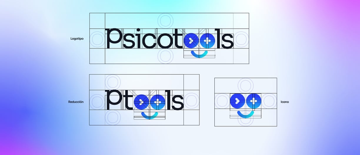
The design elements reflect the company's ethos, portraying a sense of empathy, trust, and resilience.
Through thoughtful consideration of color palettes, typography, and imagery, the redesigned Psicotools brand not only resonates with its audience but also communicates the company's dedication to offering a comprehensive suite of emotional improvement resources.


The result is a visually compelling and emotionally resonant brand that embodies the supportive journey towards enhanced emotional well-being."
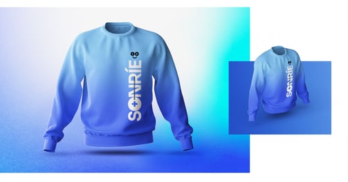
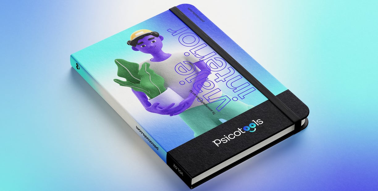
Merchandising
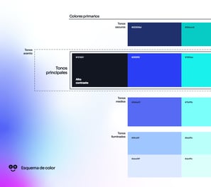
Colour system
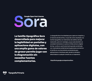
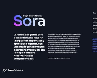
Typography (Google font)
